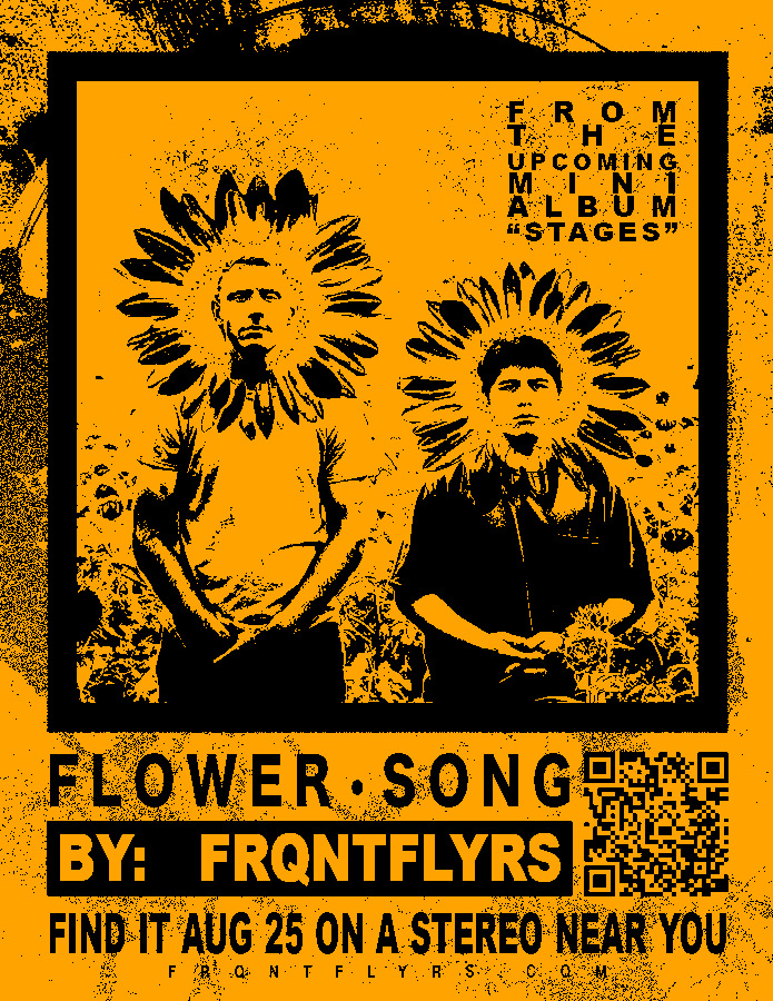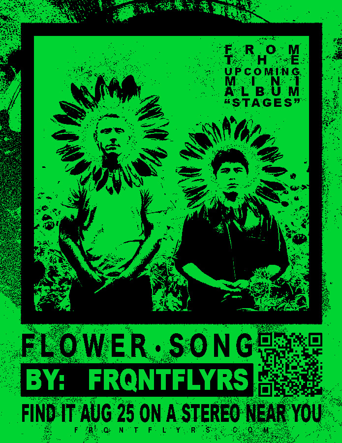


Two weeks before the first FRQNT FLYRS album came out, we put out a ton of posters to promote the second single, Flower Song. We used just about every color imaginable, but here's three of my favorites. This is my favorite design I've put together so far, and it was super last minute. Also, the original QR code was only intended for people who found the posters IRL, so I wouldn't scan these if I were you.
FYI: You can click these to view them larger!
I had to make a band poster for a graphic design class, so I did one for Volume 2. But it only took me a day and we had a few work weeks left of class, so I had to just make more posters to fill time or else I wouldn't get credit. That's where the next four posters came from.
Yes, I know I'm not actually tough enough to play with Black Flag or the Misfits.
FYI: You can click these to view them larger!
The following are just experiments where I tried to mimic another design I'd seen and warp it with something else I like--just to learn, really.
Click each one if you wanna see what the original reference was!